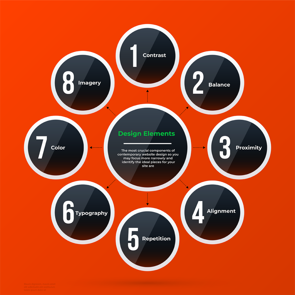
The look of websites is evolving. The necessity for current, relevant, and interesting content is one such constant, but new factors that might increase website impact are always being developed.
Some of these components aid in story-telling and clarify the essence of your business, while others aim to pique customer attention right away or enhance the user experience across all platforms. It’s not necessary to use every aspect at once (doing so might result in a cluttered and confused experience), but picking particular pieces that are in line with the objectives of your brand and website can assist increase overall impact.
We’re deconstructing the most crucial components of contemporary website design so you may focus more narrowly and identify the ideal pieces for your site. Doing so will enhance the functionality of your website.
Here is the list of Design elements that you can consider:
1. Contrast:
The use of contrasting elements, such as color, size, and typeface, to create visual interest and hierarchy.
Color contrast is created when two or more colors are placed next to each other, with one color appearing to be brighter or more vibrant than the other. This can be achieved through the use of complementary colors, such as blue and orange, or through the use of contrasting hues, such as red and green.
Size contrast is created when two or more elements are different sizes, with one element appearing larger or smaller than the other. This can be used to create a sense of hierarchy within a design, with the larger element drawing more attention than the smaller one.
Value contrast is created when two or more elements have different values, with one element appearing to be lighter or darker than the other. This can be used to create a sense of drama within a design, with the darker element drawing more attention than the lighter one.
Benefits:
- Helps to create visual interest
- Enhances brand recognition
- Helps to guide the user’s eye
- Enhances the overall aesthetics
- Helps to create emotion
2. Balance:
Balance refers to how objects, colours, textures, and space are distributed visually. These elements must be in harmony for the design to seem stable, as though it were a scale. The components employed on one side of the design are in symmetrical balance and comparable to those on the opposite side; in an asymmetrical balance, albeit the sides differ, they appear to be equally weighted. The components may be comparable and placed in radial balance around a central point.
Benefits:
- Assists in the creation of visual steadiness
- Contributes to the creation of a sense of consistency
- Aids in the creation of a feeling of proportion
- Helps to create a sense of order
3. Proximity:
According to the proximity principle, a visual design is more successful when related design components are placed close to one another. This is so that each component of the design has a spatial relationship with other elements on the page.

A spectator can see a direct relationship between two compositional parts, which can be used to convey a narrative, a framework, or an explanation of a concept. Similar to this, dividing two design elements reveals a lack of connection or link. In the same design, this can facilitate the viewer’s processing of several concepts.
Benefits:
- Improving communication
- Explicit text
- Improved readability
4. Alignment:
Alignment is one of the most significant design factors. By making sure your different design components have a good relationship with one another, it helps produce a crisp, organised look for ultimately superior designs. The most typical text alignments are centre, right, or left, but you may also choose asymmetry by having text that is aligned to other visual elements. Check your alignment if anything in your design doesn’t appear quite correct.
Benefits:
- Keeps design elements clear and consistent
- Makes the composition appear sleek and trustworthy
- Untouchable
5. Repetition:
Repetition in design refers to employing the same components repeatedly throughout a piece of work, including colours, patterns, typefaces, pictures, textures, and more. the act of repeating patterns or other design elements to give something a sense of coherence and unity.
Consistency with the user is accomplished by appropriately repeating the same colours, shapes, or lines since repetition may be utilised to reinforce learning. For instance, rugs often have patterns. Whether they are close together or have space between them, various forms and colours frequently blend together and reappearance.
Benefits:
- Creating a sense of consistency and order in a design.
- Helping to guide the viewer’s eye through a design.
- Enhancing the overall aesthetic appeal of a design.
- Making a design feel fluid or in motion.
- Helping to reinforce the overall message or theme of a design.
6. White Space:
Consistently using white space enhances readability and makes information in designs simple to scan. According to a research, using the left and right margins of a paragraph’s left and right lines properly can boost comprehension.

An good example of active whitespace is when a website flows smoothly and directs the visitor down a page to a conversion point (call-to-action, form, etc.). Active whitespace is used consciously to establish a page’s structure and natural flow.
Benefits:
- Generates balance and harmony.
- Bring the reader from one element to the next.
- Make the website appear neat and organized.
- Provide users with information.
7. Typography:
Typography is the art of arranging words and sentences such that the reader may read them clearly and with aesthetic appeal. It involves typeface look, style, and structure, all of which are intended to evoke particular feelings and deliver particular meanings. In other words, typography is what makes the text dynamic.
Benefits:
- Communication channel
- Attracts readers
- captivates the audience
- conveys emotion or sentiment
- creates an information structure
- Contributes to the creation of harmony
- Shows professionalism
- Creates and grows recognition
8. Color and Icons:
Color contributes to the composition’s tone. Humans experience color when light waves strike an item and bounce back to the optic nerve in their eyes. Color is a tool used by designers and artists to convey and characterise a subject. Designers employ color to convey mood, light, dimension, and point of view. The color wheel and the principles of colour theory “a system of rules for combining, altering, and mixing colors” are used by designers to construct color schemes.
Objects, activities, and ideas are all graphically expressed by SVG icons, which are a crucial component of many user interfaces. They have several great advantages for user interfaces, like reducing screen space and boosting visual appeal, and when used properly, they convey the essential idea and goal of a product or action.
Benefits:
- Establish the brand’s tone.
- Have an impact on the image.
- Draw the attention of the users.
- Influence their feelings.
- Boost usability.
9. Imagery:
Images in graphic design aid to tie the text to the layout and can clarify the information offered by adding meaning and eliciting associations. However, an image by itself is insufficient to convey meaning. Its meaning varies based on its context and place, or how it is utilised.
Benefits:
- Make your visuals stand out.
- communicate a message.
- Instill feelings in the audience.
- Create a unique brand identity.
- Create a feeling of genuineness.
Final Thoughts:
So, those were the nine fundamental design element. When applied correctly, these diverse aspects may help your work succeed. To do so, you’ll need to practice, experiment, and master the rules for applying them, which are known as design principles.
A beautiful design is a combination of imagination and planning, so plan your design, let your creativity flow, then subsequently, with class and confidence, break the rules slightly to achieve harmony. However, keep in mind that in order to break the rules, you must first understand them thoroughly.
To Read More Tech Blogs Visit: Technical Nick


